Clearance Redesign
Belk.com
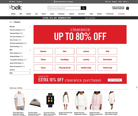
Original Clearance Page
The clearance page for Belk.com gets a lot of traffic but is does not earn the amount of clickthrough expected with the amount of traffic it receives.

competitor research
I explored the experience of competitor websites and gathered samples of how they approached a coupon page. I learned some websites used icons to make the page easier to read. Some sites tried to do this same thing with the use of photography which represented each category. Some sites were cluttered with a lot of additional and competing content. We determined we had the correct pieces and needed a UI refresh.
final design
I designed the page with icons because they are more easily read than the text buttons alone. I could have used photos but using product images runs the risk of the item being sold out or not matching seasonal changes. Also an icon represents a category in a general way where a photo can be too specific to a single item. Another reason to use icons is that it reinforces the new brand language helping to create a synchronized design across all customer experiences. I also kept competing content off the page and made the icons a large so a customer can easily find them among other content.