Coupon Page Redesign
Belk.com

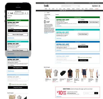
Original Coupon Page
The coupon page for Belk.com received a lot of traffic but did not produce a related amount of interaction. The original design was functional, but was mostly a data dump of competing information.
We were tasked with making this page work harder for the customer. Success would be measured by an increased use of coupons and a decrease in cart abandonment.

competitor research
We explored the experience of competitor websites and gathered samples of how they approached a coupon page.
Good: Bold promotional values. Clear hierarchy of messages. Call to action is easy to find.
Bad: Pages with more than 10 offers require a customer to read each one to find an applicable offer. Pages with several different kinds of content and all with a different visual language are difficult to read. Pages with single product page offers do not apply to our promotions.
exploration

promotion thumbnail
This idea was to create images next to each coupon to match the visual design of the coupon promotion and create a cohesive customer experience across media channels and digital locations. Promotion values were enlarged to give stronger visual hierarchy.
color bar
A color bar and color promo value
so customer can easily find information about where the coupon can be used. Online, in-store, or both.

color block
Each coupon is filled with a color to indicate whether the promotion is online, in-store, or both
coupon look & color block
These coupons are designed to match the print version of a coupon. This makes customer experience match across print and digital channels. We continue the idea of color blocking to indicate where a coupon can be used.

sketches
I explored some initial ideas to find the appropriate hierarchy and number of elements to include on the page. A few ideas were selected to explore further on the computer so they could be visualized closer to pixel perfect. Poor ideas were eliminated.
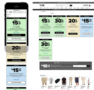
Final Design

Following the review, we learned this page needed a UI solution. The UX pieces were already in place. We determined the following needs for the page;
1. Large pricing values to differentiate between promotions
2. Coupons should look visually consistent with print in both shape and color
3. Indication when the coupon is applied
4. Indication whether the promotion is in-store, online, or both
5. Easy to read the promotion name
